Book vs. Movie: Whiteout
By Russ Bickerstaff
September 14, 2009
Much of Whiteout's charm comes from Carrie herself. She's an interesting personality. Carrie is a very inspiring and resilient person drawn into a less than inspired plot. The drama of precisely who she is, precisely what her past is and precisely what her motivations are is a very, very engaging part of the story. The problem is the format. The comic book format excels at delivering a visually dynamic story to be sure, but the artwork of Steve Lieber doesn't exactly leap off the page to deliver it. Even the action sequences lie pretty flat on the page. Occasionally we get a very interesting dramatic moment with Carrie that has been brilliantly rendered by Lieber, but for the most part, the delivery lacks enough dynamic vision to bring a largely uninspired murder mystery to life. That being said, the artwork is never actually bad...it's just uninspired. Everything is rendered with a careful eye for the drama in Rucka's script, but in order to elevate the story beyond the basic architecture of a standard murder/mystery, there really needs to be some sort of overarching brilliance. It's all too easy to blame this on comic books in general for being the wrong type of medium for this type of story. This is kind of a cop-out. Drama can be brilliantly delivered in comic book format in a way that is distinct and unique to the medium. The work of people like Dave Sim (Cerebus) and Frank Miller (Sin City and his work on Daredevil) show the potential here. So why is it that the dramatic potential of the medium fails in Whiteout?
With two different people responsible for bringing the story across, it's difficult to tell who to blame with respect to Whiteout's shortcomings. The script may have dictated to Lieber how the story should be drawn — thus limiting the artist's creative freedom, bringing about a flat and lifelessly rendered story. Perhaps Rucka's vision for the visuals of the story weren't sufficiently expressed in the script. Whatever the case, the graphic novel feels like a relatively good idea (a murder/mystery in Antarctica) delivered without sufficient appreciation for the magic of storytelling.
The Movie
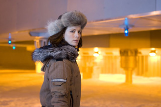
The film opens with a scene on a Russian plane over the Antarctic during the Cold War. A jovial atmosphere quickly turns stale. There's gunfire. The pilot gets hit with a stray bullet. The plane crashes. The film then moves to a far more recognizable plot point. Carrie Stetko is arriving at a science outpost in the Antarctic. Right away the film establishes a very dynamic visual feel. There's a really beautiful tracking shot where we watch as Carrie walks into the outpost, through a hall of people doing a variety of things to try to keep themselves sane in the middle of nowhere. There's a tropical-themed party getting set-up and a heady amount of activity going on in a very, very small space. Carrie walks in to her room, takes off her parka and proceeds to shower. It's a very beatufiul opening scene and there's nothing quite like it in the graphic novel. The unique culture of the Antarctic outposts is lost in the comic book. While what appears on the screen may not be totally authentic, it at least establishes itself as being something more than a murder in a small town and that's absolutely crucial to establishing the unique atmosphere of the story.
Continued:
1
2
3
|
|
|
|


