|
|
Oscar 2012: Final Predictions Part TwoBy Tom HousemanFebruary 16, 2012
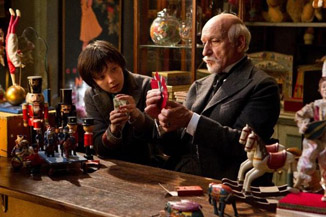
Best Art Direction “Spectacular, Spectacular” declares Harold Zidler during a scene in Moulin Rouge! in which he is trying to impress his producer. He might have been talking about Oscar voters, though, and he would have been right, since Moulin Rouge! won both Best Art Direction and Best Costumes. The winners in this category are all about spectacle, being big and grandiose. Lots of sets, lots of locations, always something either from the past or from a fantasy world. So the question you have to ask yourself is not which film has the most detailed or intricate sets, but which one has the biggest. The most spectacular. When you phrase it like that, one film seems to be the clear frontrunner. Hugo not only recreates the world of 1930s Paris, it also recreates the lavish sets that George Mellies used in his films. There are so many different impressive sets, from the train station to inside the clock, to the library to the theater. The last time Scorsese made a film about a filmmaker it was The Aviator, which also won Best Art Direction. Yes, The Artist is definitely a threat in this category, but this is one case where being in black and white could hurt it. While creating sets designed to be photographed in black and white is a challenge, it is not the kind that non-professionals would know anything about. All they know is that it doesn't stand out as much. Its Best Picture frontrunner status will also not be much help, since as many Best Picture winners have lost this category in the last decade (Gladiator and The King's Speech) as have won (Chicago and Return of the King. Will Win: Hugo Might Win: The Artist Dark Horse: War Horse
|

|
|
|

|
Thursday, October 31, 2024
© 2024 Box Office Prophets, a division of One Of Us, Inc.


