|
|
They Shoot Oscar Prognosticators, Don't They?Handicapping the “Below the Line” Races – Part TwoBy J Don BirnamFebruary 5, 2014
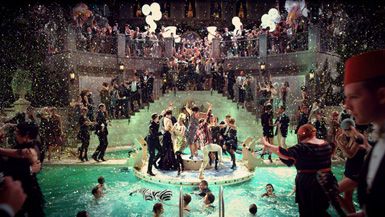
Sadly, this year’s choices strike me as remarkably weak and perhaps the best example of a branch just sheepishly checking off Best Picture contenders. The sets in American Hustle are not at all memorable, as it has to be relatively simple to obtain 1970s artifacts from studios’ back lots in Hollywood. Nor was I particularly impressed by the set decoration of 12 Years a Slave, although I could see how some would respect the slave and plantation houses - the sort of woodwork that likely got Sweeney Todd its Best Art Direction Oscar. It does not get much better, in my opinion, with Her’s nomination for Best Production Design. I appreciate the branch’s respect for the more minimalist, futuristic work, but the sets were just not all that, in my view. For the win it thus comes down to two entries - Gravity, once more, as the presumptive “technical awards” front-runner, versus the impressive and glamorous sets of The Great Gatsby. I confess some ignorance regarding the degree of difficulty of Gravity’s Art Direction - I suppose the space stations were singularly complex. My instinct, however, tells me that Gatsby has what it takes to pull it off over the presumptive technical front-runner, like Lincoln did last year over Life of Pi, or like Alice in Wonderland did before that over The King’s Speech. The reason is simple: it is the best designed of the bunch, and these last two victories demonstrate that the Academy is not afraid to award the Oscar to the more deserving as opposed to the most liked. Both the opulent interior and the façades of the Long Island mansions jump out more to the viewer than anything in Gravity. I thus predict that designer Catherine Martin, a previous winner in this category for Moulin Rouge!, will add another trophy to her collection. Still, it is worth wondering why the branch did not find space for much more difficult and showy sets, like those in The Hobbit and its impressive scene inside the dwarf mountain; Catching Fire and the work done in the districts and the Hunger Games arena; or even the artful Elysium, where the contrasting sets are essentially a character in the story. The answer, I suspect, lies in the relatively weak awards season performance by those movies, and/or the fact that the Academy doesn't generally recognize big commercial blockbusters without an artsy gloss to them. Ultimately, however, it reflects poorly on the branch to simply pick Best Picture front runners because they like the movie, at the expense of better designed movies.
|

|
|
|

|
Friday, November 1, 2024
© 2024 Box Office Prophets, a division of One Of Us, Inc.


