Movie Review: Steve Jobs
By Ben Gruchow
October 29, 2015
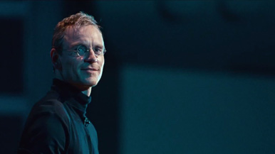
Steve Jobs is attractively shot and put together in a disarming way, and it’s actually pretty impressive how the movie makes it most of the way to the final third before it starts to engage in the kind of verbal grandstanding that Sorkin tends to indulge in - erudite, clearly intelligent, but loud and opinionated and much less like dialogue than prepared statements and conclusions. What Boyle does with the look of the movie is stealthier: the first sequence, in 1984, has the grainy and low-contrast look of footage and film from that era. The second sequence, in 1988, has a much clearer and more stately appearance, and we finally arrive at high-gloss digital sheen in the third sequence, set in 1998.
Usually, when filmmakers attempt to evoke different time periods with the visual look of the film, they shoot digitally and apply filters, digital grain and noise, digital scratches. This movie does not bear the hallmarks of digital footage manipulated to look “old,” and here, I learned that the 1984 sequences were shot on Super 16mm film, the 1988 sequences on Super 35mm film, and the 1998 sequences on the Red Epic digital system. It’s a gimmick, but it’s an honest one, and I appreciated the filmmakers’ decision to go all the way with the illusion and evocation.
The temperament of Steve Jobs, pitched pretty consistently save for a couple of moments near the end, affects how the movie is best considered. Each of the scenes here hold a rough corroboration with a chapter in the 2011 book on Jobs by Walter Isaacson (for information’s sake, they’re Chapters 15, 18, and 27). That book serves as source material for the movie, with other key moments that weren’t directly adapted referred to over the course of conversation in the movie’s present (the similarity between the GUIs for LISA and Xerox PARC, which was either correlation or causation depending on who you read, is a prime example of this; another one is the neat way that the ultimate fate of the Apple Macintosh - and of Jobs’ first go-round with Apple - is shown in micro-scenes nested inside each other while the principals talk about it in the present).
That temperament is responsible for the flow and structure of the film, or maybe the structure gave birth to the temperament. Either way, you could grade Steve Jobs only a partial success as an adaptation. It helps here to consider that the book is over 600 pages long, and that the nature of Jobs’ work with Apple was ambiguous and (sometimes) rocky enough to fill out a much more crowded film, but it still presents a more complete and textured portrait of the man than the movie does. Much of the movie’s conflict is centered around Jobs’ muted and academic relationship with the girl who could be his daughter, also named Lisa; the weight of this conflict in comparison to all of the others throughout Jobs’ career is justified (or at least explained) by an admonishment given to Jobs late in the movie by his longtime assistant and confidante Joanna (Kate Winslet, rather effortlessly playing to three different time periods of age and experience and weariness), but this is not the only way the same conclusion could have been arrived at, nor the most courageous.
As a biography, the movie is pretty enthralling, and it’s proof-positive that the real impact in biographical films comes from the little moments and asides, not the big machinery of moving through predetermined points in the central figure’s life or career, telling as it does complete character arcs within the constriction of a handful of brisk and unsentimental scenes. The resolutions provided are not pat or glossed over. The rhythm is assured and consistent without being rote. This is one of the few biographical films where a potential sequel, done in the same way, would contain measurable artistic merit.
Continued:
1
2
|
|
|
|


